
Colour vs Form
to Aliki van der Kruijs’ windowWith the usage of the Dylon grains within the silkscreen process I found out a new way of developing colours. I started to work with the exposed silkscreen, including the squares (cut–outs of the Monstera leaves). In multiple ways I tried to work with it, but I realised that form and colour where not working together. The ink is not supporting the image and visa versa.
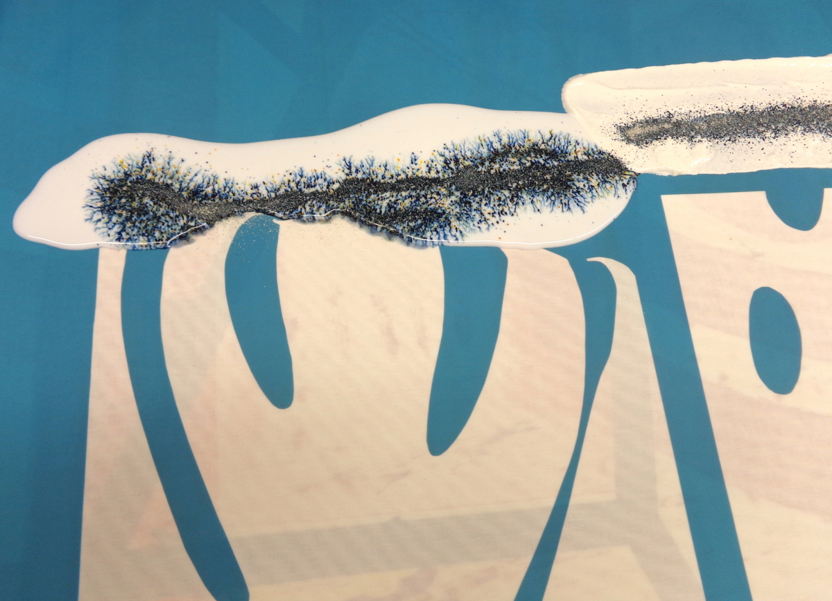
The best way to print the leaf shapes seemed to be with an almost solid colour structure. But this will only support form, it would not show the colour structure at its best.
To my opinion form and colour clash in this case, visually and even conceptually. What I did in the Split leaf post was deconstructing the Monstera leaf, as a visual grammar research. During the whole process I zoomed more and more into the leaf and it resulted in a new way of printing.
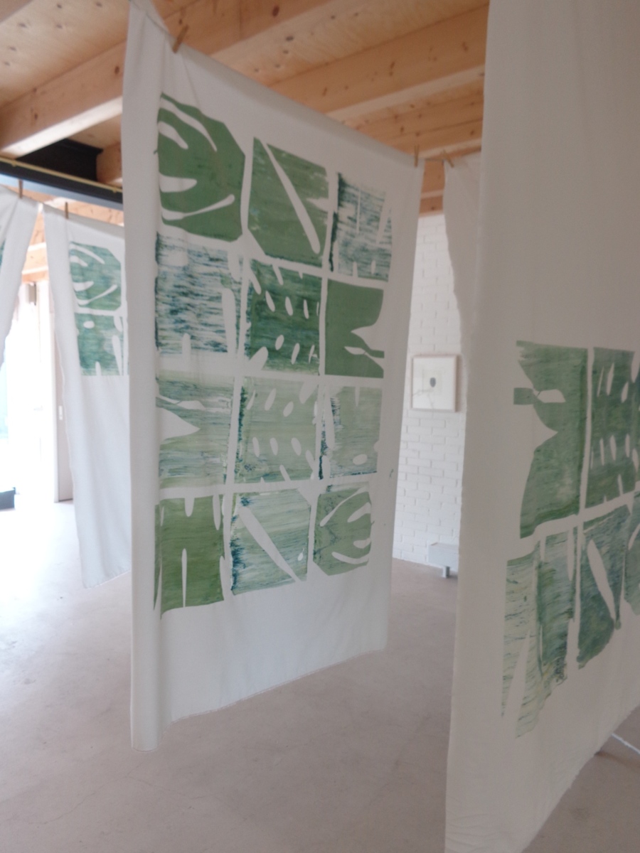
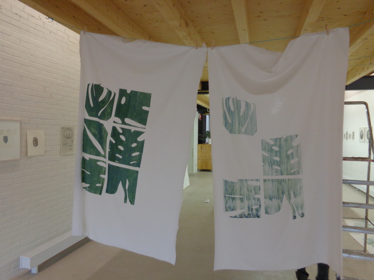
Conclusion: the grid of leaves don’t fit any more, because it becomes too illustrative. So I’ve made a radical decision: empty the screen!
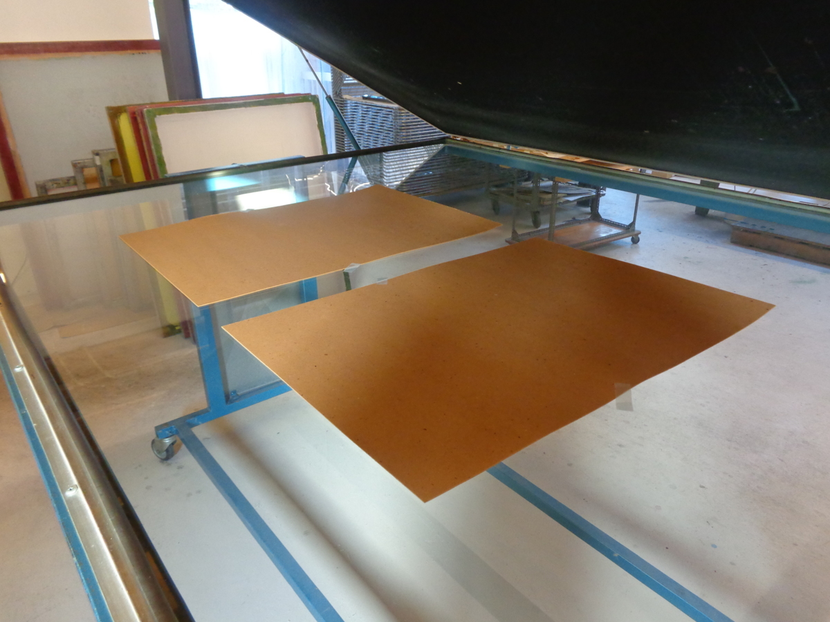
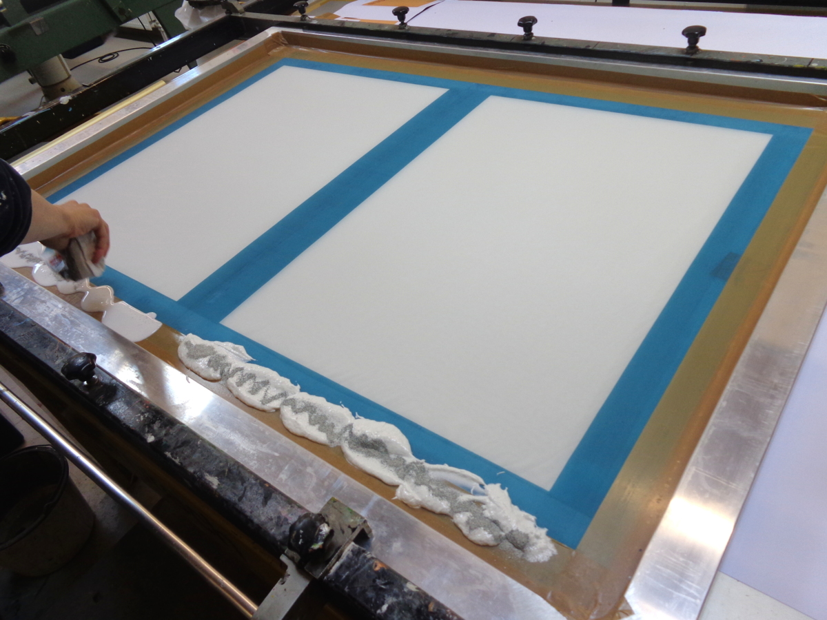
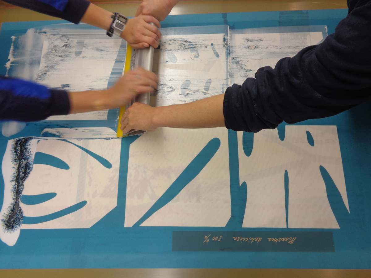
Now the screen is empty again I will continue in such a way that the colour structure would flourish in the best way: an abstract form. For the size I looked at the given screen: The silk screen is 100×140 cm. Within the printable space I exposed two rectangles of 50×70 cm on the screen to be able to print textile in full colour.
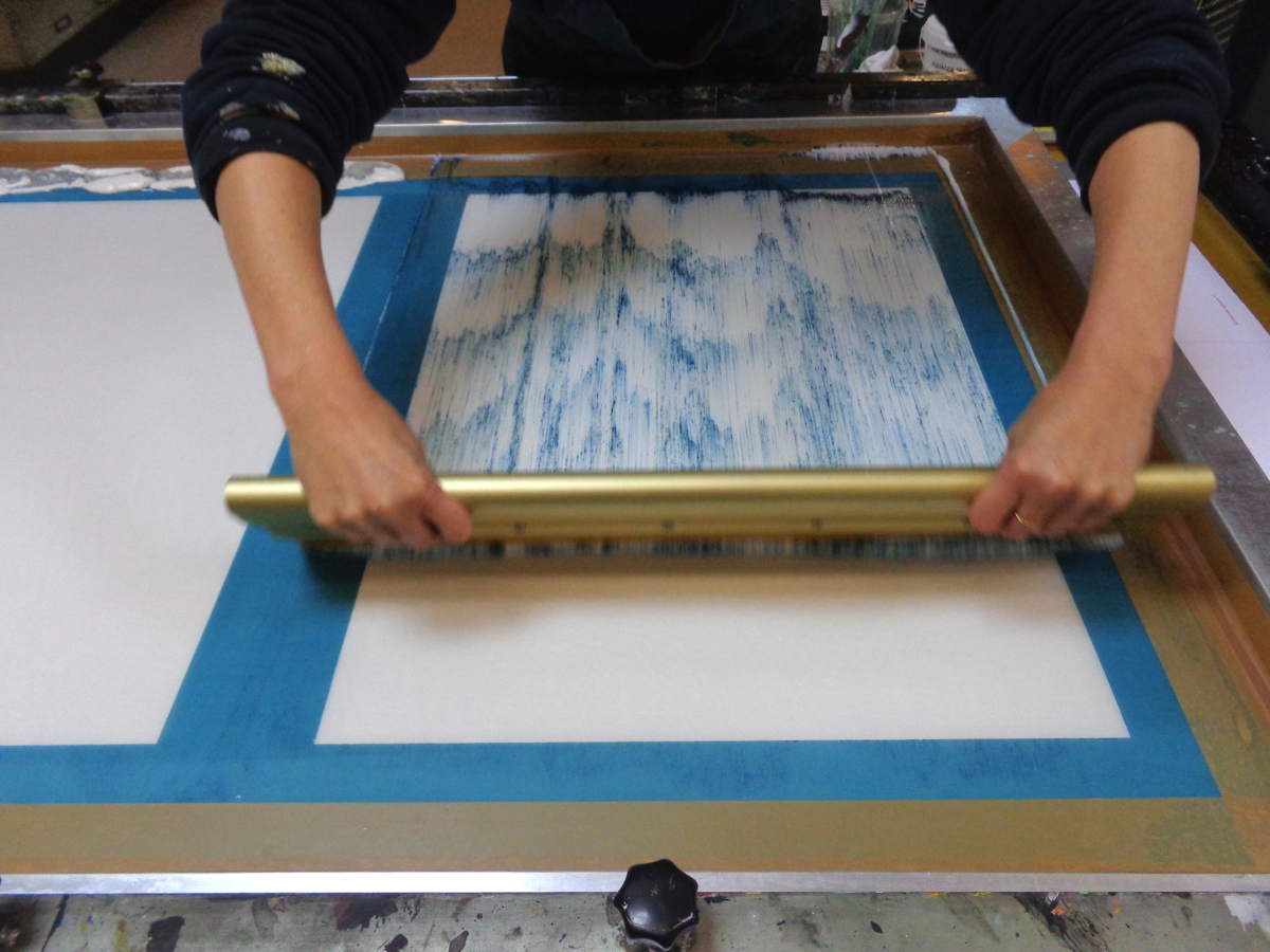
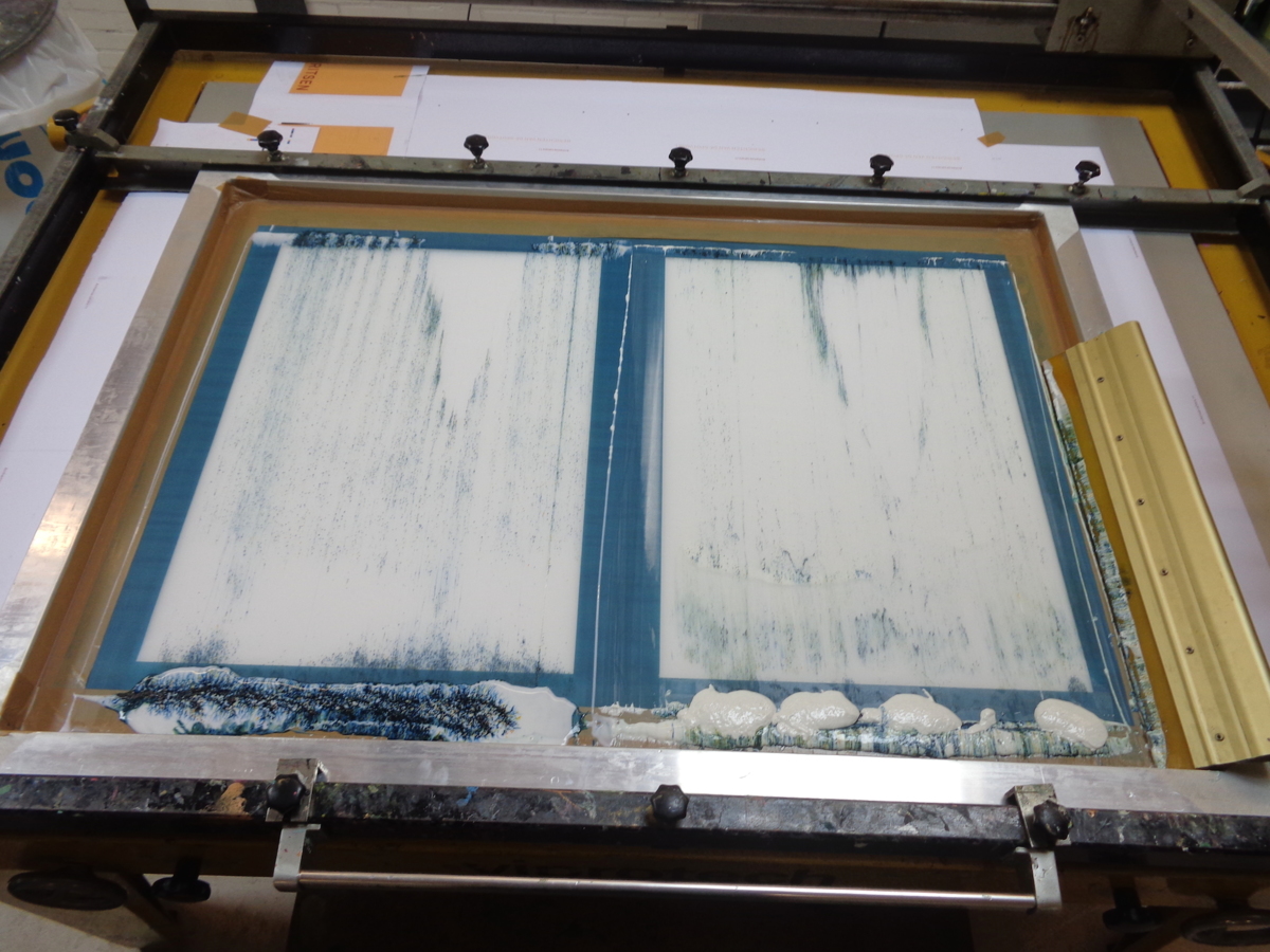
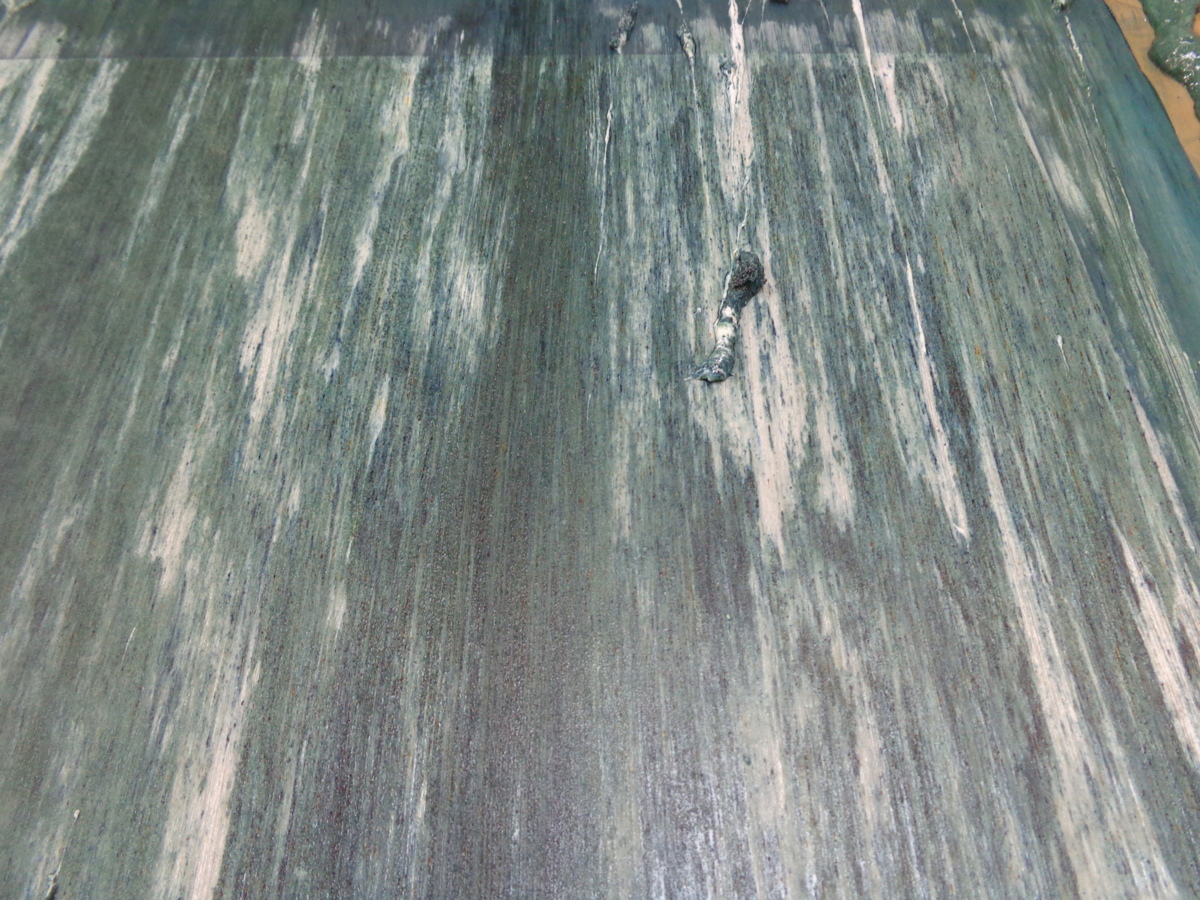
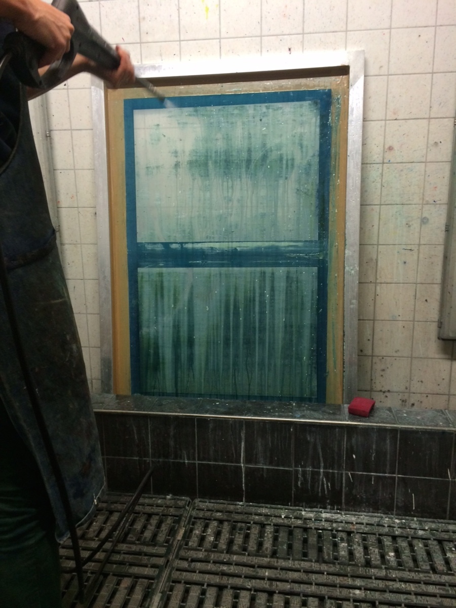
After 5 print runs the mesh is full of base & Dylon. After such a series I rinse it out and start with developing new prints.